
It as if marijuana has taken over the U.S. by storm as over half of the states now have some sort of legal framework for the plant. With more states expected to get in on all the action, it seems as though the world of cannabis marketing is growing at an immense pace as well. A new study has shown that as many as 55% more design projects have been made for new brands in the marijuana industry over the past year.
Although the limiting factor for most businesses getting involved in cannabis is the state and national law, there are no laws regarding who can and cannot make advertising and packaging designs for companies involved in the marijuana space. Designers have been flocking to this new industry due to the massive amount of growth that they are reporting. The market has been full of cliches as any good market is, but new designs are becoming better than ever. Several trends have been emerging over the past few years and these are just a few.
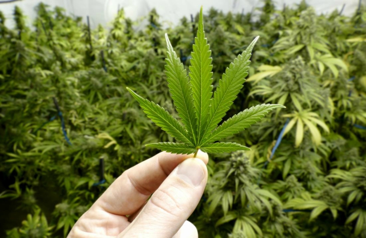
One of the most popular trends for cannabis advertising and what could be considered a cliche is the leaf image. The image of the marijuana plant has been reproduced in many ways throughout time, and constantly remains one of the most prolific designs used in the cannabis industry. These logos can continue to look good, but only if they are changed up and made to be modern with clean lines and cleaner colors.
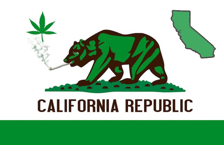
An important trend in the market that has continued to surface is that of the color green and what it symbolizes. Green has been a notorious symbol of the pot industry, but it also has been that of the recycling and reusing movement. Throughout the past decade, the use of the color green and the word itself in ethos has been a historic paradigm shift in the way we treat our products and how they are disposed of. Many companies have decided to hop on this trend by promoting the green-ness of their products. This can be anything from promoting raw and organic trends to using the actual color to help promote the market. Whichever way a company goes about it, there is no going wrong with the color green when advertising for the cannabis industry.
Another trend in the market has been the promotion of the healthier aspect of the plant. Many new companies have come out with the idea of promoting the healthiness of cannabis and their products for the body and the environment respectively. This branding has presented quite a large opportunity for the medicinal and pharmaceutical side of the industry, but adding symbols and colors to help promote the healthier side of cannabis can also help to bring new attention to the market. These designs can come from the cross shape among other designs, as well as packaging that hints at the origins of the product coming from a plant. These designs have helped to shift the idea that cannabis is a manufactured plant, into something that is entirely different.
My personal favorite design for packaging in the industry comes from that of minimalism. Minimalism has been a large movement for quite some time now, but the simplicity and effectiveness of these designs have helped to bring the products into an upper tier of the industry. Minimalism can often promote higher quality and more focus on design, leading customers to believe they are getting a better product. Through the use of clean minimalist design, packaging in the industry has never been more beautiful. The hopes are high that companies can continue to use effective design methods to improve the usefulness and effectiveness of their products altogether.
MAPH Enterprises, LLC | (305) 414-0128 | 1501 Venera Ave, Coral Gables, FL 33146 | new@marijuanastocks.com